Blog August 30, 2026
Monocards 1.5: markers, labels and redaction
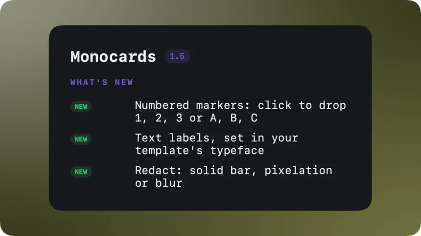
Almost every card I share ends up needing a finger pointing at something. This is the spike. These are the three steps. Do not read that column. Monocards had arrows and boxes for that, but the finger-pointing vocabulary was incomplete. Version 1.5 finishes it: numbered markers, free text labels, and redaction for the parts nobody should see.
It is live now. Existing users get it through the built-in updater; the full list is on the changelog. Here is what shipped and why.
Numbered markers
Switch on marker mode and every click drops the next number on the card: 1, 2, 3, or A, B, C if you prefer letters. The upcoming marker floats under your cursor as a preview, so you always know what the click will place.
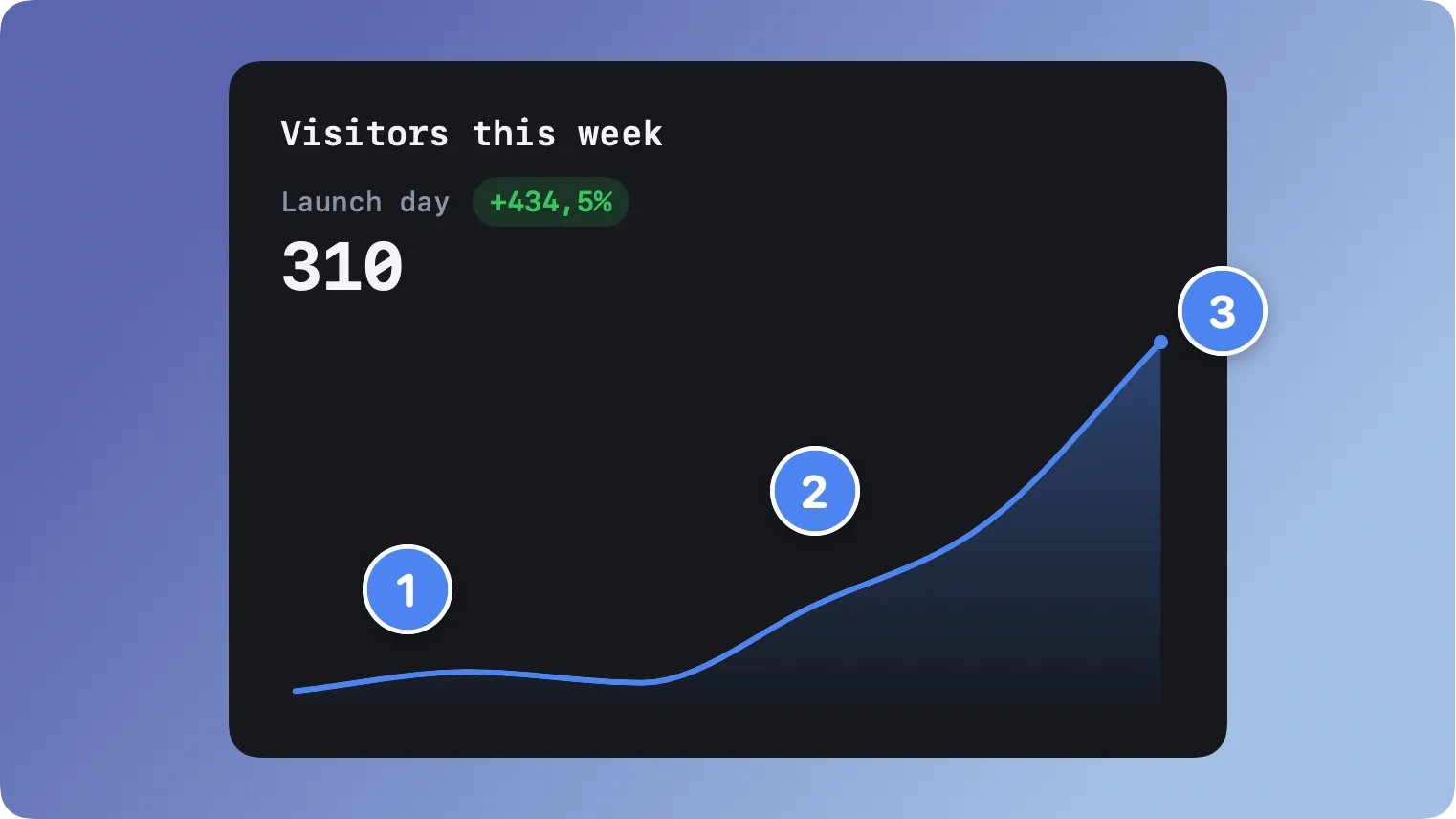
The details took longer than the feature. One card carries one series: delete a marker and the numbering stays sane, switch from numbers to letters and every placed marker converts along. The series settings, starting value, size, border, restyle the whole card at once instead of one bubble at a time. And the markers follow your accent color until you pick your own, so they arrive on-brand instead of arriving red.
This is for every walkthrough, every “three things about this chart”, every screenshot that needs a guided order. Point, click, done.
Text labels
Sometimes the annotation is the words. The new text label drops anywhere on the card, and you type it straight into the floating toolbar while it renders live on the card.
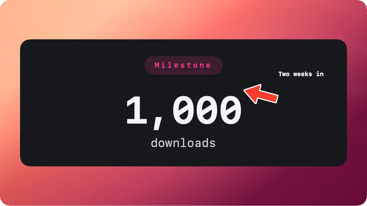
One decision I want to defend: the label is set in your template’s own typeface, not in some separate annotation font. A label that matches the card reads as part of the design. A label in a foreign font reads as graffiti. Arrow plus label next to it is the classic combination, and now both halves live in the same place.
Redaction
The one I am happiest about. Screenshots carry more than you mean to share: an email column, an API key, a customer name in a support thread. 1.5 adds redaction zones with three styles, a solid bar, pixelation, and blur, each with its own strength.
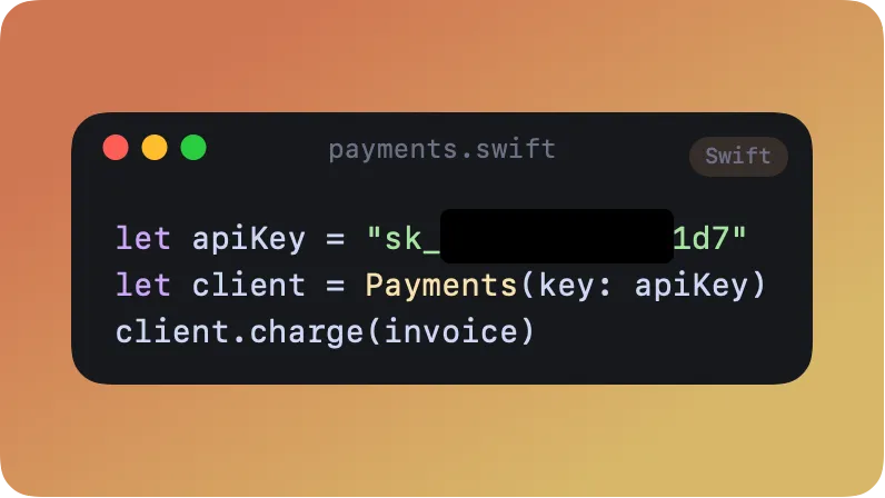
The default is the solid bar, and that is deliberate. Light blur on text can be reversed, the math runs backwards well enough to recover short strings like keys and amounts, so blur is a style choice, not a security measure. The bar replaces the pixels outright. We even wrote a test that fails the build if the pixelation effect ever silently stops rendering in exports, because a redaction that looks applied but is not would be the worst kind of bug.
And because Monocards renders everything locally, the unredacted original never leaves your Mac on its way to the shareable version. That order matters.
Why annotations, on a design app
Monocards’ whole idea is that the template does the design so you only bring content. Annotations looked like the opposite: freehand chaos on top of a controlled look. We built them anyway, carefully, because the cards people actually share almost always carry one extra layer of intent: look here. A device mockup of your new screen wants a marker on the button that changed. A weekly chart wants a label on the dip. A support screenshot wants the customer’s details gone.
So the annotation family follows the same rules as everything else: markers and labels pick up your accent and typeface, everything is vector so it exports sharp at every size, and every piece works in preview, export and the animated clips identically. It is the pointing layer, in the same handwriting as the card. The product teams page shows where this ends up in a release workflow.
The small print
Version 1.5 is a free update inside every license’s update window, which in practice means everyone right now. Arrows, boxes, ellipses and emoji annotations were already there; markers, labels and redaction join them in the same palette next to the preview. Everything is on the card level, so it travels with the design, reopens editable, and exports in every format the card does.
If you make one thing with it this week, make it this: take the screenshot you were about to share, drop a marker on the thing that matters, and bar the thing that does not. That is the whole feature, and it is thirty seconds well spent.