Blog August 28, 2026
How to make a weekly status report people actually read
I have written hundreds of weekly status reports in twenty years of shipping software, and I can count the ones I know were read on one hand. The tell is always the same: on Thursday someone asks a question that Monday’s report answered, in writing, in the second paragraph.
That is not a reading problem. That is a writing problem, and it is fixable.
Nobody reads reports. They scan them.
The first thing to accept is that your report is not an article. Your manager has nine of these in their inbox. Stakeholders open them on a phone, between meetings, looking for exactly one thing: do I need to do something, or not.
Search for “weekly status report” and you get pages of PowerPoint templates, which tells you what the world thinks a report is: a deck to present. But most weekly reports are never presented. They are skimmed in Slack, in Teams, in a mail thread. So the format that wins is not the one that fills a meeting. It is the one that answers “are we okay?” in five seconds and rewards another thirty seconds if someone keeps reading.
Write for the scan first, the read second.
What goes in, and what stays out
After years of overwriting these, here is the shortest structure that still does the job:
One health signal. On track, at risk, or off track. Color it if you can. This is the five-second answer, and it goes first, not buried under “context”.
Three numbers. The ones that moved or matter this week. Revenue, signups, tickets closed, days to deadline. Not twelve numbers. Three.
What got done. Short list, past tense, no adjectives.
What is next. Same shape, so next week’s “done” is this week’s “next” and everyone can see the thread.
Blockers, with names. A blocker without an owner and an ask is a complaint. “Waiting on legal review since Tuesday, need sign-off from Sara” is a report.
What stays out: the activity log. Hours spent, meetings attended, the paragraph that proves you were busy. Busy is not status. If the report exists to justify your week, it will read like it, and people will stop opening it.
Show status, do not describe it
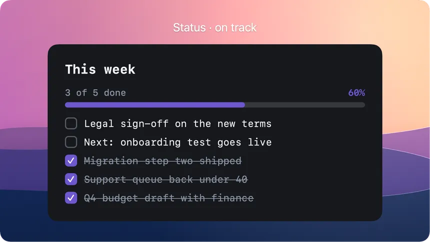
“We made good progress on the migration and expect to be largely complete soon” is a sentence someone has to decode. A checklist with three of five items ticked and a progress bar at 60% is the same information with the decoding already done.
This is why the classic red-amber-green convention survives every generation of management fashion: it moves status from language to sight. The same goes for checkmarks, progress bars, and a delta next to a number. Every visual element you use is a sentence the reader does not have to parse.
The practical rule: anything that is a state, show it. Anything that is a decision or a nuance, write it. Most weekly reports have far more state than nuance, which is why most of them should look more like a scoreboard than an essay.
Numbers beat adjectives
“Support load is improving” and “38 tickets, down from 61” describe the same week. Only one of them survives being forwarded.
Adjectives make reports feel safe to write and vague to read. Numbers do the opposite: they feel exposed, and they build trust precisely because of that. If the number is bad, say the number and what you are doing about it. A report that only carries good numbers trains readers to look for what is missing, and they learn that faster than you would think.
One more habit worth stealing: keep the same three numbers week after week. A number without last week’s number is trivia. The delta is the story.
Send it where people already look
The best-written report dies in a folder nobody opens. The worst-kept secret of status reporting is that distribution beats composition.
A report that lands as a message in the channel where the team already lives gets read at a rate a slide deck never will. And a report that lands as an image gets scanned even by people who would not have clicked a link: the chart, the checklist and the numbers are just there, in the scroll, no file to open.
That is exactly the wall where good reports usually die, though. Turning your status into something that looks sharp in a channel means opening a design app on a Monday morning, and nobody does that twice. This is the job the List, Stats and Chart cards in Monocards were built for: type the items or the numbers, and the card comes out styled, in your look, sized for wherever you post it. The reports at work page shows what a week of those looks like. The app is optional here, as always. The principle is not: a report people see beats a report people have to fetch.
Save the deck for the meeting that actually is a meeting. The weekly rhythm belongs in the channel.
Make it look the same every week
The final trick is boring on purpose: fix the format and never change it.
Same order, same three numbers, same visual language, every week. Consistency does two things. It makes the report skimmable, because readers learn where everything lives and their eyes go straight there. And it quietly signals that the work is under control, because a report that looks decided reads as a project that is decided.
This also makes the report cheap to produce, which is the part everyone underestimates. A format you rebuild every Monday is a format you will abandon by October. A format that is a template, where you only change the content, takes ten minutes and survives busy weeks. Decide the look once, then stop deciding.
The ten-minute version
If you take one thing from this: health signal first, three numbers with deltas, done, next, blockers with owners. Show state visually, write only the nuance, send it where people already look, and keep the format identical every week.
That is a report someone reads in five seconds, trusts in thirty, and never has to ask about on Thursday. Which, if we are honest, is the whole reason it exists.